An app redesign of The New York Times with a goal of meeting the needs of modern users
This project was initiated by an 8 week intensive course at the Fashion Institute of Technology (FIT) focusing on User Experience Design. As a team of three, our job was to redesign an existing app to meet the needs of modern users. We selected The New York Times because our team saw its vast potential to be a platform of accessible and reliable news for varying age groups — something that is sorely needed in an era of misinformation.
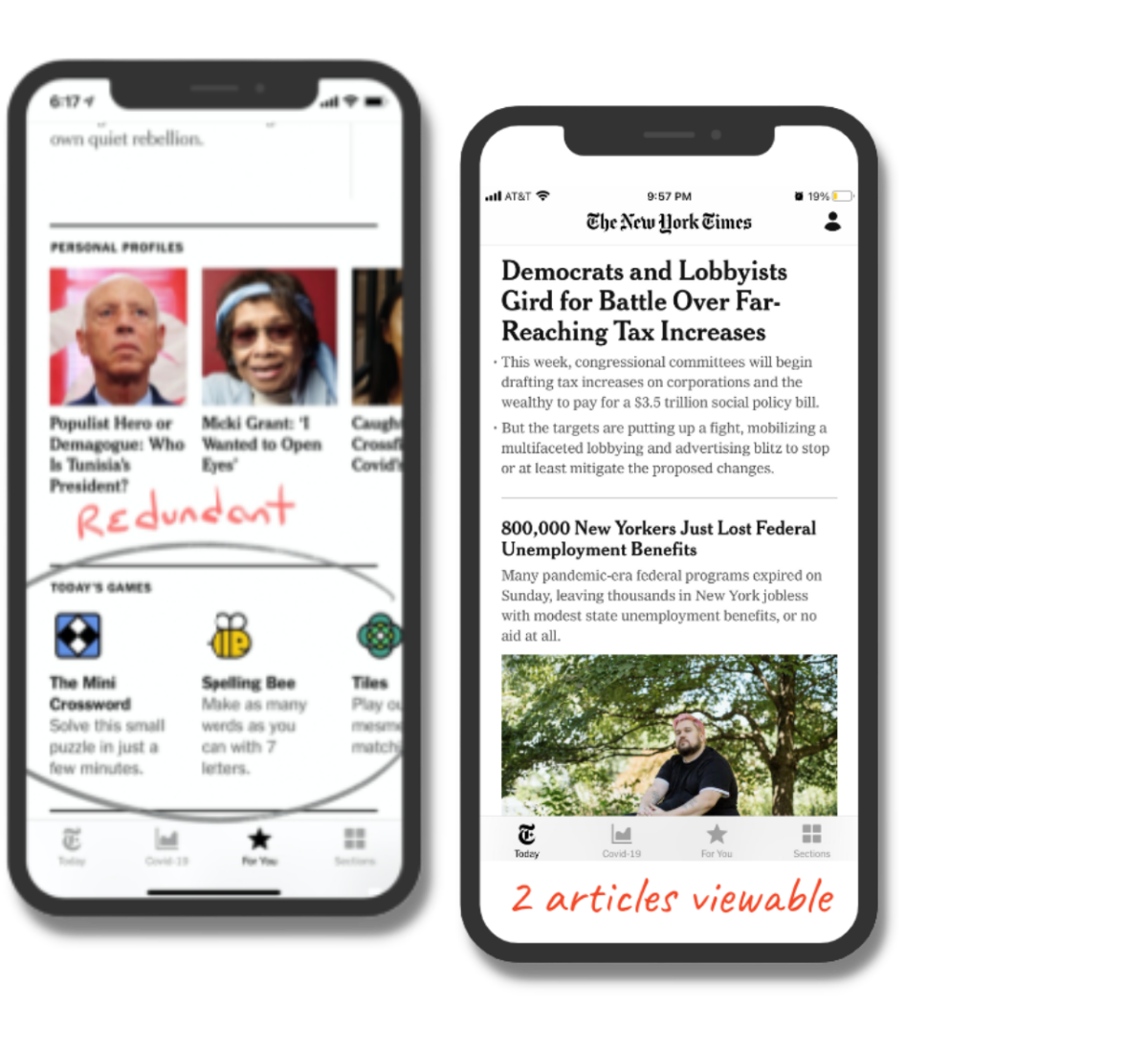
In our initial overview of the app we discovered some key flaws that hindered the user experience. The search function, a highly used feature in apps, is currently nested within the "sections" menu. The "For You" menu felt impersonal and did not reflect the user's interests. Most pages were very condensed and text heavy, and often included redundant content such as the Times' game menu.
Heuristic Evaluation
The first competitor we analyzed is National Public Radio. NPR holds a similar reputation as The New York Times, yet the majority of NPR's content is free to access and offers listenable articles or radio recordings tied to the stories that provide a secondary method of experiencing news. The ability to listen to articles can be a great opportunity to reach audiences that may not have the time to read a full article or have the attention span.
Twitter and social media in general was another obvious competitor to a news publication like The New York Times. Social media platforms like Twitter offer quick bites of information that are easily accessible, however, the validity of the information presented is not as consistent as The New York Times. Unlike the previous competitors, The Wall Street Journal and physical newspapers require a paid subscription and availability of newspapers vary.
Competitor Analysis
As a team, our goal was to design a cohesive application that engages users across age groups. it would allow easy access to high use areas such as search and categories. The overall experience would be more personalized for the user and would allow them to explore interests. An increase in visual touch points and gesture controls will compliment the exploration of new stories and topics.
Redesign Goals
1
2
3
4
Design a cohesive app that engages users of varying ages
Accessibility to high use areas such as search & categories
More personalized experience for the user
Increase visual touch points & gesture controls
We discovered the audience of The New York Times are mainly living on the east and west coasts of the United States, many of them living in metropolitan areas or near universities, and who are 30 - 50 years of age. The New York Times experienced usage spikes during key political and From this research our team investigated three different target segmentations.
Who is the audience?
The first being city-based, low income, Gen-Z college students; to learn more about the needs of the New York Times' future user base
The second segmentation reflects older millennials with an established career who are weary of fake or unverified news; to learn more about the current user's needs
The last segmentation our team investigated are college-educated, liberal millennials living outside of metropolitan areas; to discover the potential of audiences outside the locations of the typical New York Times subscriber
Each team member was responsible for investigating each target segmentation through empathy interviews. I interviewed at least 10 different people who fit within the third target segmentations. I was fascinated by the variety of behaviors and skepticism of our target audience. Looking to the third segmentation, I found that most of the interviewees felt that they could not make the time commitment to reading an article. And when they did, the user would often cross reference an article based on the user's interest of severity of the story.
Empathy Interviews
"I read the news when I have time. . . usually while doing something else like folding laundry or driving to work."
"If I'm really interested in a certain topic I will cross reference the facts I am concerned with, using publications like NPR and Associated Press."
Our team compiled the data from our 30+ interviews and we worked to find the similar user pain points across our three different segmentations. The key takeaways from our research are that our target audience views the app as text dense and not conducive to the user's busy lifestyle. Users are also weary of news validity and often seek to cross reference the given facts or stories.
Affinity Mapping
The persona I developed reflected our third target segmentation: college-educated millennials who live outside metropolitan areas and who align with democratic ideas. Phoebe is a politically-liberal millennial who wants to stay up to date with evolving news stories. Because of their busy lifestyle they find it hard to be engaged with important issues, and that makes them feel overwhelmed and insecure about their knowledge of current events. They also live in a less populated area she doesn't feel like she has access to reliable news sources to cross reference the facts.
Developing the Persona
What are Phoebe’s needs?
1. Engaging in issues they are passionate about 2. Receiving news in a quick and efficient way 3. Feeling informed after reading the news 4. Building a habit to increase news consumption
The Minimum Viable Product
"When I live in a remote community with limited news sources I want to have access to ones that are trustworthy and compliment my busy lifestyle, so I can be aware of issues that affect my loved ones and community."
Redesign Elements
Creating the For You page in the existing app into the home page on the new app makes the experience more personalized and the content more relevant for the user. The new For You page includes content from preferred categories that can be adjusted in user settings.
Personalized News Experience
Audio articles became a crucial part of our redesign and how we could address the time constraints of our users. With audio articles becoming more common among publications like NPR and The Chicago Tribune, it was also a necessary element to include to stay up to date with the rest of the news industry. Through our new design users can listen to articles of all types, have the capability to adjust the audio settings, and save the audio article to their saved items.
Audio Articles
Our redesign makes it much easier for users to cross reference the news by offering published research findings from other news sources within the articles.
Cross Referencing
From our research and interview process, we understood the need to create a streamlined way for users to consume news in a way that is not time consuming and leaves them feeling informed. In the redesign we incorporated multiple ways to access the news including: an story or reel like queue based off of Instagram's story structure, and content blocks reassuring the user that they are caught up for that day.
Concise News Experience
After completing 25 moderated user tests of the design, our team learned more about the user behaviors and what changes could be made to enhance their experience. We found that our users require larger icons/touch points, a dark-mode setting, and additional navigation within the article pages.
User Testing
The new redesign feels more personal and reflects the interests of the user. Audiences of all ages can now interact with the news that is most comfortable to them. Whether it be listening to audio articles, reading while cross referencing the facts, or swiping through the article carousel for quick bites of news. These new design elements reinforce the The New York Times impeccable journalistic reputation while catering to the needs of a diverse audience demographic.
Final Thoughts
Want to work together?
If you like what you see and want to work together, get in touch!


.png)
.png)

.png)
.png)